

10 kinds of loading animations implemented with CSS3, pick one and go?

|
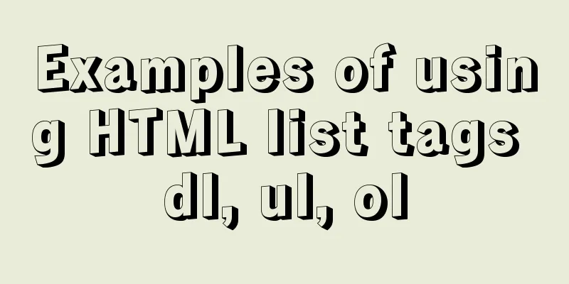
Effect
html
<body>
  <div class="content">
    <h3>CSS3 Loading animations</h3>
    <div class="load-wrapp">
      <div class="load-1">
        <p>Loading 1</p>
        <div class="line"></div>
        <div class="line"></div>
        <div class="line"></div>
      </div>
    </div>
    <div class="load-wrapp">
      <div class="load-2">
        <p>Loading 2</p>
        <div class="line"></div>
        <div class="line"></div>
        <div class="line"></div>
      </div>
    </div>
    <div class="load-wrapp">
      <div class="load-3">
        <p>Loading 3</p>
        <div class="line"></div>
        <div class="line"></div>
        <div class="line"></div>
      </div>
    </div>
    <div class="load-wrapp">
      <!-- Loading 4 don't work on firefox because of the border-radius and the "dashed" style. -->
      <div class="load-4">
        <p>Loading 4</p>
        <div class="ring-1"></div>
      </div>
    </div>
    <div class="load-wrapp">
      <div class="load-5">
        <p>Loading 5</p>
        <div class="ring-2">
          <div class="ball-holder">
            <div class="ball"></div>
          </div>
        </div>
      </div>
    </div>
    <div class="load-wrapp">
      <div class="load-6">
        <p>Loading 6</p>
        <div class="letter-holder">
          <div class="l-1 letter">L</div>
          <div class="l-2 letter">o</div>
          <div class="l-3 letter">a</div>
          <div class="l-4 letter">d</div>
          <div class="l-5 letter">i</div>
          <div class="l-6 letter">n</div>
          <div class="l-7 letter">g</div>
          <div class="l-8 letter">.</div>
          <div class="l-9 letter">.</div>
          <div class="l-10 letter">.</div>
        </div>
      </div>
    </div>
    <div class="load-wrapp">
      <div class="load-7">
        <p>Loading 7</p>
        <div class="square-holder">
          <div class="square"></div>
        </div>
      </div>
    </div>
    <div class="load-wrapp">
      <div class="load-8">
        <p>Loading 8</p>
        <div class="line"></div>
      </div>
    </div>
    <div class="load-wrapp">
      <div class="load-9">
        <p>Loading 9</p>
        <div class="spinner">
          <div class="bubble-1"></div>
          <div class="bubble-2"></div>
        </div>
      </div>
    </div>
    <div class="load-wrapp">
      <div class="load-10">
        <p>Loading 10</p>
        <div class="bar"></div>
      </div>
    </div>
  </div>
  <div class="clear"></div>
</body>
CSS3
/* -----------------------------------------
  =Default css to make the demo more pretty
-------------------------------------------- */

body {
  margin: 0 auto;
  padding: 20px;
  max-width: 1200px;
  overflow-y: scroll;
  font-family: "Open Sans", sans-serif;
  font-weight: 400;
  color: #777;
  background-color: #f7f7f7;
  -webkit-font-smoothing: antialiased;
  -webkit-text-size-adjust: 100%;
  -ms-text-size-adjust: 100%;
}

.content {
  padding: 15px;
  overflow: hidden;
  background-color: #e7e7e7;
  background-color: rgba(0, 0, 0, 0.06);
}

h1 {
  padding-bottom: 15px;
  border-bottom: 1px solid #d8d8d8;
  font-weight: 600;
}

h1 span {
  font-family: monospace, serif;
}

h3 {
  padding-bottom: 20px;
  box-shadow: 0 1px 0 rgba(0, 0, 0, 0.1), 0 2px 0 rgba(255, 255, 255, 0.9);
}

p {
  margin: 0;
  padding: 10px 0;
  color: #777;
}

.clear {
  clear: both;
}

/* -----------------------------------------
  =CSS3 Loading animations
-------------------------------------------- */

/* =Elements style
---------------------- */
.load-wrapp {
  float: left;
  width: 100px;
  height: 100px;
  margin: 0 10px 10px 0;
  padding: 20px 20px 20px;
  border-radius: 5px;
  text-align: center;
  background-color: #d8d8d8;
}

.load-wrapp p {
  padding: 0 0 20px;
}
.load-wrapp:last-child {
  margin-right: 0;
}

.line {
  display: inline-block;
  width: 15px;
  height: 15px;
  border-radius: 15px;
  background-color: #4b9cdb;
}

.ring-1 {
  width: 10px;
  height: 10px;
  margin: 0 auto;
  padding: 10px;
  border: 7px dashed #4b9cdb;
  border-radius: 100%;
}

.ring-2 {
  position: relative;
  width: 45px;
  height: 45px;
  margin: 0 auto;
  border: 4px solid #4b9cdb;
  border-radius: 100%;
}

.ball-holder {
  position: absolute;
  width: 12px;
  height: 45px;
  left: 17px;
  top: 0px;
}

.ball {
  position: absolute;
  top: -11px;
  left: 0;
  width: 16px;
  height: 16px;
  border-radius: 100%;
  background: #4282b3;
}

.letter-holder {
  padding: 16px;
}

.letter {
  float: left;
  font-size: 14px;
  color: #777;
}

.square {
  width: 12px;
  height: 12px;
  border-radius: 4px;
  background-color: #4b9cdb;
}

.spinner {
  position: relative;
  width: 45px;
  height: 45px;
  margin: 0 auto;
}

.bubble-1,
.bubble-2 {
  position: absolute;
  top: 0;
  width: 25px;
  height: 25px;
  border-radius: 100%;
  background-color: #4b9cdb;
}

.bubble-2 {
  top:auto;
  bottom: 0;
}

.bar {
  float: left;
  width: 15px;
  height: 6px;
  border-radius: 2px;
  background-color: #4b9cdb;
}

/* =Animate the stuff
------------------------ */
.load-1 .line:nth-last-child(1) {
  animation: loadingA 1.5s 1s infinite;
}
.load-1 .line:nth-last-child(2) {
  animation: loadingA 1.5s 0.5s infinite;
}
.load-1 .line:nth-last-child(3) {
  animation: loadingA 1.5s 0s infinite;
}

.load-2 .line:nth-last-child(1) {
  animation: loadingB 1.5s 1s infinite;
}
.load-2 .line:nth-last-child(2) {
  animation: loadingB 1.5s 0.5s infinite;
}
.load-2 .line:nth-last-child(3) {
  animation: loadingB 1.5s 0s infinite;
}

.load-3 .line:nth-last-child(1) {
  animation: loadingC 0.6s 0.1s linear infinite;
}
.load-3 .line:nth-last-child(2) {
  animation: loadingC 0.6s 0.2s linear infinite;
}
.load-3 .line:nth-last-child(3) {
  animation: loadingC 0.6s 0.3s linear infinite;
}

.load-4 .ring-1 {
  animation: loadingD 1.5s 0.3s cubic-bezier(0.17, 0.37, 0.43, 0.67) infinite;
}

.load-5 .ball-holder {
  animation: loadingE 1.3s linear infinite;
}

.load-6 .letter {
  animation-name: loadingF;
  animation-duration: 1.6s;
  animation-iteration-count: infinite;
  animation-direction: linear;
}

.l-1 {
  animation-delay: 0.48s;
}
.l-2 {
  animation-delay: 0.6s;
}
.l-3 {
  animation-delay: 0.72s;
}
.l-4 {
  animation-delay: 0.84s;
}
.l-5 {
  animation-delay: 0.96s;
}
.l-6 {
  animation-delay: 1.08s;
}
.l-7 {
  animation-delay: 1.2s;
}
.l-8 {
  animation-delay: 1.32s;
}
.l-9 {
  animation-delay: 1.44s;
}
.l-10 {
  animation-delay: 1.56s;
}

.load-7 .square {
  animation: loadingG 1.5s cubic-bezier(0.17, 0.37, 0.43, 0.67) infinite;
}

.load-8 .line {
  animation: loadingH 1.5s cubic-bezier(0.17, 0.37, 0.43, 0.67) infinite;
}

.load-9 .spinner {
  animation: loadingI 2s linear infinite;
}
.load-9 .bubble-1,
.load-9 .bubble-2 {
  animation: bounce 2s ease-in-out infinite;
}
.load-9 .bubble-2 {
  animation-delay: -1s;
}

.load-10 .bar {
  animation: loadingJ 2s cubic-bezier(0.17, 0.37, 0.43, 0.67) infinite;
}

@keyframes loadingA {
  0 {
    height: 15px;
  }
  50% {
    height: 35px;
  }
  100% {
    height: 15px;
  }
}

@keyframes loadingB {
  0 {
    width: 15px;
  }
  50% {
    width: 35px;
  }
  100% {
    width: 15px;
  }
}

@keyframes loadingC {
  0 {
    transform: translate(0, 0);
  }
  50% {
    transform: translate(0, 15px);
  }
  100% {
    transform: translate(0, 0);
  }
}

@keyframes loadingD {
  0 {
    transform: rotate(0deg);
  }
  50% {
    transform: rotate(180deg);
  }
  100% {
    transform: rotate(360deg);
  }
}

@keyframes loadingE {
  0 {
    transform: rotate(0deg);
  }
  100% {
    transform: rotate(360deg);
  }
}

@keyframes loadingF {
  0% {
    opacity: 0;
  }
  100% {
    opacity: 1;
  }
}

@keyframes loadingG {
  0% {
    transform: translate(0, 0) rotate(0deg);
  }
  50% {
    transform: translate(70px, 0) rotate(360deg);
  }
  100% {
    transform: translate(0, 0) rotate(0deg);
  }
}

@keyframes loadingH {
  0% {
    width: 15px;
  }
  50% {
    width: 35px;
    padding: 4px;
  }
  100% {
    width: 15px;
  }
}

@keyframes loadingI {
  100% {
    transform: rotate(360deg);
  }
}

@keyframes bounce {
  0%,
  100% {
    transform: scale(0);
  }
  50% {
    transform: scale(1);
  }
}

@keyframes loadingJ {
  0%,
  100% {
    transform: translate(0, 0);
  }

  50% {
    transform: translate(80px, 0);
    background-color: #f5634a;
    width: 25px;
  }
}
The above are 10 loading animations implemented with CSS3. Pick one and go. For more details about CSS3 loading animation, please pay attention to other related articles on 123WORDPRESS.COM! |
<<: How to deploy springcloud project with Docker
>>: MySQL beginners can say goodbye to the troubles of grouping and aggregation queries


Recommend
IIS7 IIS8 reverse proxy rule writing, installation and configuration method
Purpose: Treat Station A as the secondary directo...
How to use Docker Swarm to build WordPress
cause I once set up WordPress on Vultr, but for w...
Detailed explanation of the execution process of mysql update statement
There was an article about the execution process ...
Historical Linux image processing and repair solutions
The ECS cloud server created by the historical Li...
Prometheus monitors MySQL using grafana display
Table of contents Prometheus monitors MySQL throu...
Font Treasure House 50 exquisite free English font resources Part 2
Designers have their own font library, which allo...
Vue implements sample code to disable browser from remembering password function
Find information Some methods found on the Intern...
JavaScript file loading and blocking issues: performance optimization case study
Let me start with a question: When writing an HTM...
Detailed explanation of soft links and hard links in Linux
Table of contents 1. Basic storage of files and d...
Introduction to scheduled tasks in Linux system
Table of contents 1. Customize plan tasks 2. Sync...
3 ways to add links to HTML select tags
The first one : Copy code The code is as follows: ...
Linux disk management LVM usage
1. Introduction to LVM When we manage Linux disks...
How to hide rar files in pictures
You can save this logo locally as a .rar file and...
Summary of B-tree index knowledge points in MySQL optimization
Why do we need to optimize SQL? Obviously, when w...
Analysis of the solution to Nginx Session sharing problem
This article mainly introduces the solution to th...