
Sample code for implementing dynamic glowing special effects animation of circles using pure CSS3
|
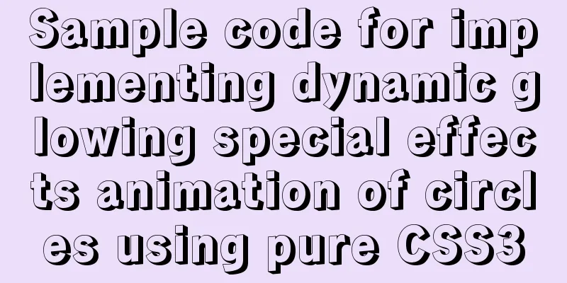
This article mainly introduces the sample code of pure CSS3 to realize the dynamic glowing special effects animation of circles, and shares it with you. The details are as follows: Effect picture:
Code:
<!DOCTYPE HTML>
<html>
<head>
    <title>Pure CSS3 to achieve dynamic circle glowing special effects animation</title>
    <style>
        body {
            background-color: #000000;
        }

        @keyframes twinkling {
            0% {
                opacity: 0.2;
                transform: scale(1);
            }

            50% {
                opacity: 0.5;
                transform: scale(1.12);
            }

            100% {
                opacity: 0.2;
                transform: scale(1);
            }
        }

        .circle-wrap {
            position: absolute;
            left: 100px;
            top: 100px;
        }

        .circle {
            position: relative;
            width: 24px;
            height: 24px;
        }

        .small-circle {
            border-radius: 50%;
            width: 12px;
            height: 12px;
            background: #FF0033;
            position: absolute;
        }

        .big-circle {
            position: absolute;
            top: -6px;
            left: -6px;
            width: 100%;
            height: 100%;
            border-radius: 50%;
            background: #FF0033;
            animation: twinkling 1s infinite ease-in-out;
            animation-fill-mode: both;
        }

        @keyframes scale {
            0% {
                transform: scale(1)
            }

            50%,
            75% {
                transform: scale(3)
            }

            78%,
            100% {
                opacity: 0
            }
        }

        @keyframes scales {
            0% {
                transform: scale(1)
            }

            50%,
            75% {
                transform: scale(2)
            }

            78%,
            100% {
                opacity: 0
            }
        }

        .smallcircle2 {
            position: absolute;
            width: 12px;
            height: 12px;
            background-color: #ffffff;
            border-radius: 50%;
            top: 100px;
            left: 200px;
        }

        .smallcircle2:before {
            content: '';
            display: block;
            width: 12px;
            height: 12px;
            border-radius: 50%;
            opacity: .4;
            background-color: #ffffff;
            animation: scale 1s infinite cubic-bezier(0, 0, .49, 1.02);
        }

        .bigcircle2 {
            position: absolute;
            width: 12px;
            height: 12px;
            border-radius: 50%;
            opacity: .4;
            background-color: #ffffff;
            top: 100px;
            left: 200px;
            animation: scales 1s infinite cubic-bezier(0, 0, .49, 1.02);
        }

        @keyframes scaless {
            0% {
                transform: scale(1)
            }

            50%,
            75% {
                transform: scale(3)
            }

            78%,
            100% {
                opacity: 0
            }
        }

        .item {
            position: absolute;
            width: 14px;
            height: 14px;
            background-color: #FFFF00;
            border-radius: 50%;
            top: 150px;
            left: 100px;
        }

        .item:before {
            content: '';
            display: block;
            width: 14px;
            height: 14px;
            border-radius: 50%;
            opacity: .7;
            background-color: #FFFF00;
            animation: scaless 1s infinite cubic-bezier(0, 0, .49, 1.02);
        }
    </style>
</head>
<body>
    <div class="circle-wrap">
        <div class="circle">
            <div class="big-circle"></div>
            <div class="small-circle"></div>
        </div>
    </div>
    <div class="smallcircle2"></div>
    <div class="bigcircle2"></div>
    <div class="item"></div>
</body>
</html>
The specific implementation of this effect mainly uses CSS3 animation It has 8 properties: animation-name specifies the name of the @keyframes animation. animation-duration animation duration Used to specify the duration of an element's animation in seconds (s) or milliseconds (ms). The default value is 0 animation-timing-function specifies the speed curve of the animation. The default is "ease". animation-delay specifies when the animation starts. The default is 0. Negative values are allowed, the animation skips 2 seconds and enters the animation cycle, that is, starting from the 2s animation animation-iteration-count specifies the number of times the animation is played. The default value is 1 animation-direction specifies whether the animation should play in reverse direction on the next cycle. The default is "normal". animation-fill-mode specifies whether the animation effect should be visible before or after the animation is played. animation-play-state specifies whether the animation is running or paused. The default is "running". In short, animation : name duration timing-function delay iteration-count direction fill-mode play-state Original text: https://blog.csdn.net/qq_34576876/article/details/95532946 https://blog.csdn.net/weixin_42541698/article/details/102686976 This concludes this article about the sample code for implementing dynamic glowing circle special effects animation using pure CSS3. For more relevant CSS3 dynamic glowing circle content, please search previous articles on 123WORDPRESS.COM or continue to browse the related articles below. I hope you will support 123WORDPRESS.COM in the future! |
<<: Spring Boot layered packaging Docker image practice and analysis (recommended)
>>: HTML uses regular expressions to test table examples


Recommend
Solution to the failure of 6ull to load the Linux driver module
Table of contents 0x01 Failed to load the driver ...
MySQL query syntax summary
Preface: This article mainly introduces the query...
Native js implements custom scroll bar component
This article example shares the specific code of ...
Windows CVE-2019-0708 Remote Desktop Code Execution Vulnerability Reproduction Issue
1. Vulnerability Description On May 15, 2019, Mic...
MySQL bypasses granting information_schema objects and reports ERROR 1044 (4200) error
This question is a discussion among netizens in a...
MySQL 8.0.11 compressed version installation and configuration method graphic tutorial
MySQL 8.0 compressed package installation method,...
Detailed explanation of how to reduce memory usage in MySql
Preface By default, MySQL will initialize a large...
Detailed explanation of the use and differences of various lock mechanisms in Linux
Preface: I believe that those who need to underst...
Gitlab practical tutorial uses git config for related configuration operations
This article introduces the content related to gi...
Detailed tutorial on installing JDK8 on Linux system (CentOS7 installation)
JDK Installation I won't go into too much det...
Browser compatibility summary of common CSS properties (recommended)
Why do we need to summarize the browser compatibi...
Implementation example of Docker rocketmq deployment
Table of contents Preparation Deployment process ...
Mini Program Custom TabBar Component Encapsulation
This article example shares the specific code for...
Uncommon but useful tags in Xhtml
Xhtml has many tags that are not commonly used but...
Docker Basic Tutorial: Detailed Explanation of Dockerfile Syntax
Preface Dockerfile is a script interpreted by the...