


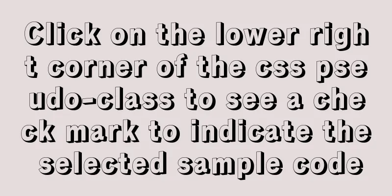
Click on the lower right corner of the css pseudo-class to see a check mark to indicate the selected sample code
|
Effect:
css:
.s_type {
    border: none;
    border-radius: 5px;
    background-color: #f3f3f3;
    padding: 7px 0;
    color: #606266;
    margin: 5px 2.5% 5px 0;
    width: 30%;
    position: relative;
}

.select {
    background-color: #ebf3ff;
    color: #5999fc;
}

.select {
    background-color: #ebf3ff;
    color: #5999fc;
}

.select:before {
    content: '';
    position: absolute;
    right: 0;
    bottom: 0;
    border: 9px solid #5999fc;
    border-top-color: transparent;
    border-left-color: transparent;
}
html: <button class="s_type">All</button> <button class="s_type">Summer 2020</button> js:
$('.s_type').on('click',function(){
$(this).toggleClass('select');
});
1: Design the style of the button itself (.s_type) At first, I thought of many methods, such as directly adding content: '✔' in the pseudo-class; but the result is that the check mark has no background color, and it is directly white, which is not acceptable. I also thought about directly cutting out the UI image and making the background or image float directly on the button, but later I thought this was not right. Then I will work on other functions first, write them out, and then work on this one. I just happened to see an article with the same function as I needed, so I wrote it directly according to this blog. . . Then the effect came out hahahaha Later, I looked at the UI library and found that QQ's UI library also has a special corner mark design (address) Appendix: Let's look at the CSS check box style The following selected styles are often used in projects.
I searched online and found that the idea is to deform the rectangle and implement the subscript CSS style through pseudo elements:
.select {
		position: relative;
		width:81px;
		height:93px;
		margin: 0 auto;
		text-align: center;
		line-height: 93px;
		color: #4ABE84;
		background-color: #fff;
		box-shadow:0px 2px 7px 0px rgba(85,110,97,0.35);
		border-radius:7px;
		border:1px solid rgba(74,190,132,1);
	}
	.select:before {
		content: '';
		position: absolute;
		right: 0;
		bottom: 0;
		border: 17px solid #4ABE84;
		border-top-color: transparent;
		border-left-color: transparent;
	}
	.select:after {
		content: '';
		width: 5px;
		height: 12px;
		position: absolute;
		right: 6px;
		bottom: 6px;
		border: 2px solid #fff;
		border-top-color: transparent;
		border-left-color: transparent;
		transform: rotate(45deg);
	}
Then we use div to show the effect: <div class="select">Test</div> Finish. This is the end of this article about the sample code for clicking the check mark in the lower right corner of a CSS pseudo-class to indicate selection. For more information about the check mark in the lower right corner of CSS, please search previous articles on 123WORDPRESS.COM or continue to browse the related articles below. I hope that everyone will support 123WORDPRESS.COM in the future! |
<<: Detailed steps to build a file server in Windows Server 2012
>>: How a select statement is executed in MySQL


Recommend
React homepage slow loading problem performance optimization case detailed explanation
After studying React for a while, I want to put i...
Basic JSON Operation Guide in MySQL 5.7
Preface Because of project needs, the storage fie...
my.cnf (my.ini) important parameter optimization configuration instructions
MyISAM storage engine The MyISAM storage engine i...
CenOS6.7 mysql 8.0.22 installation and configuration method graphic tutorial
CenOS6.7 installs MySQL8.0.22 (recommended collec...
Examples of using provide and inject in Vue2.0/3.0
Table of contents 1. What is the use of provide/i...
How to reset MySQL root password
Table of contents 1. Forgot the root password and...
Detailed steps for using jib for docker deployment in Spring Cloud
Introduction to Jib Jib is a library developed by...
JavaScript modularity explained
Table of contents Preface: 1. Concept 2. The bene...
CSS float property diagram float property details
Using the CSS float property correctly can become...
Docker image import and export code examples
Import and export of Docker images This article i...
MySQL intercepts the sql statement of the string function
1. left(name,4) intercepts the 4 characters on th...
Summary of ten principles for optimizing basic statements in MySQL
Preface In the application of database, programme...
Docker solution for logging in without root privileges
When you use the docker command for the first tim...
A detailed introduction to deploying RabbitMQ environment with docker
Prerequisites: Docker is already installed 1. Fin...
Installation and usage analysis of Portainer, a visual UI management tool for Docker
Portainer is an excellent Docker graphical manage...