
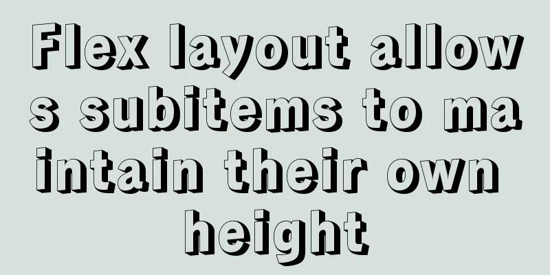
Example of implementing TikTok text shaking effect with CSS
|
In daily development, front-end students often argue over some animations and designs. The designers want to implement them with code, while the front-end designers want to design gif images. In the end, no one gives in, the designers leave, and the front-end designers are left to work overtime alone... CSS technology is a skill that must be mastered by the front-end. Not only must it be mastered, but it must also be proficient in. With the current trend of front-end frameworks being prevalent, programmers have fewer and fewer opportunities to write styles. With component-based development, there is hardly a need to write a single line of CSS code for a page. Even if you don't write it, you must understand the principle behind it. From the perspective of web page performance, animations that can be implemented with CSS should never use JS, and animations that can be implemented with JS should never use GIF. When executing animations, CSS can call the machine's GPU to execute, so its performance is naturally much better than JS. The above TikTok text shaking can be achieved using CSS animation by changing the shadow direction of the text and setting the blur effect of the looped animation frame. Knowing the principle will be much simpler. You might as well think about it more often in your daily life. The effect diagram is as follows:
Attach the code
body {
  margin: 0;
  padding: 0;
  display: flex;
  justify-content: center;
  align-items: center;
  min-height: 100vh;
  background: #000;
}
h2 {
  color: #fff;
  font-family: sans-serif;
  font-size: 4em;
  animation: animate 0.5s linear infinite;
}

@keyframes animate {
  0%, 100% {
    text-shadow: -1.5px -1.5px 0 #0ff, 1.5px 1.5px 0 #f00;
  }
  25% {
    text-shadow: 1.5px 1.5px 0 #0ff, -1.5px -1.5px 0 #f00;
  }
  50% {
    text-shadow: 1.5px -1.5px 0 #0ff, 1.5px -1.5px 0 #f00;
  }
  75% {
    text-shadow: -1.5px 1.5px 0 #0ff, -1.5px 1.5px 0 #f00;
  }
}
This concludes this article about how to use CSS to implement TikTok text shaking effects. For more relevant CSS text shaking content, please search for previous articles on 123WORDPRESS.COM or continue to browse the related articles below. I hope you will support 123WORDPRESS.COM in the future! |
<<: Web front-end skills summary (personal practical experience)
>>: 【HTML element】Detailed explanation of tag text


Recommend
How to enter directory/folder in Linux without using CD command
As we all know, without the cd command, we cannot...
Three ways to jump to a page by clicking a button tag in HTML
Method 1: Using the onclick event <input type=...
How to build a virtual machine with vagrant+virtualBox
1. Introduction Vagrant is a tool for building an...
Tutorial on processing static resources in Tomcat
Preface All requests in Tomcat are handled by Ser...
How to recompile Nginx and add modules
When compiling and installing Nginx, some modules...
Control the light switch with js
Use js to control the light switch for your refer...
How to Customize Bash Command Prompt in Linux
Preface As we all know, bash (the B ourne-A gain ...
Implementation steps for building Webpack5-react scaffolding from scratch (with source code)
Table of contents webpack5 Official Start Buildin...
How to use vue-bootstrap-datetimepicker date plugin in vue-cli 3
Demand Background Recently, I plan to use Vue and...
Detailed explanation of the correct way to configure SSL (https certificate) in Apache on Ubuntu
First, take a look at Alibaba Cloud's officia...
Getting started with JavaScript basics
Table of contents 1. Where to write JavaScript 2....
Vue encapsulation component tool $attrs, $listeners usage
Table of contents Preface $attrs example: $listen...
Install MySQL 5.7 on Ubuntu 18.04
This article is compiled with reference to the My...
CSS achieves the effect of two elements blending (sticky effect)
I remember that a few years ago, there was an int...
Solution for coexistence of multiple versions of PHP under Linux system (super simple)
Since PHP7 came out, as a fan of the latest versi...