


From CSS 3D to spatial coordinate axis with source code
|
One time we talked about the dice rolling game. At that time, we used a steps attribute + sprite image to make frame animation. This is of course quite good, but in fact, this is not what I thought at the beginning. I wanted to use real 3D and animation to do it. This plan involves a lot of spatial knowledge. Today I will tell you how to play this CSS 3D. First, the effect picture:
Basic idea: three-layer structure: perspective container >> carrier >> specific 3D image. Perspective container: determines the 3D rendering effect. The perspective attribute here receives parameters in pixels. The larger the perspective value, the farther the eyes are from the object being observed, and the smaller the value, the closer the eyes are to the object being observed. Without the perspective attribute, the viewing angle cannot be adjusted.
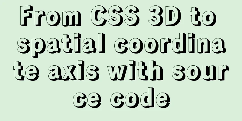
Carrier: Supports 3D images The biggest difference between this vector and ordinary HTML tags is that it has an additional attribute: transform-style:preserve-3d. Indicates that it supports 3D image display. If this attribute is missing, the 3D graphics that have undergone 3D conversion will be compressed into a 2D plane and will not be able to present a 3D effect, because the container is flat, even if the content is 3D. Concrete 3D images: conversion from 2D to 3D The 3D images here are all converted from 2D plane images, so how to convert them? You need to use the translateX, translateY, translateZ attributes, of course the abbreviation is translate-3d, and rotateX, rotateY, rotateZ and so on. The specific rules of translate and rotate are based on the famous reference picture below: three-dimensional coordinate diagram.
First, let's talk about the rules of translate. There is no need to explain this in detail. Just refer to it. For example, translateZ(-100px) in this picture is equivalent to moving the image 100px in the direction of the -z axis. A more vivid way of saying it is "sunken 100px into the screen." translateX, translateY and so on. The difficulty lies in rotate. Let me tell you a very simple rule of judgment: if the positive axis is facing the eyes, the clockwise rotation angle is positive, and the counterclockwise rotation angle is negative. It's that simple. For example, if we want to make a 3D dice, first, the six planes are placed in the center of the three-dimensional coordinate system as shown in the figure above. Their sizes are the same as the carrier. To turn them into a dice, the following transformations need to be done: (Note: The length and width of the carrier and the six faces are both 200px)
Just refer to the 3D picture and make some gestures and you will know what is going on. Attach all source code:
<template>
  <div class="box">
    <section class="cube">
      <div class="front">Front</div>
      <div class="back">Back</div>
      <div class="left">Left</div>
      <div class="right">Right</div>
      <div class="top">Above</div>
      <div class="bottom">Below</div>
    </section>
  </div>
</template>
<style lang="less" scoped>
.box {
  width: 100%;
  height: 100%;
  perspective: 500px;
}
.cube {
  position: relative;
  width: 200px;
  height: 200px;
  margin: 100px auto;
  color: #ff92ff;
  font-size: 36px;
  font-weight: 100;
  text-align: center;
  line-height: 200px;
  transform-style: preserve-3d;
  transform: rotateX(-50deg) rotateY(-50deg) rotateZ(0deg);
  // animation: move 8s infinite linear;
  @keyframes move {
    0% {
      transform: rotateX(0deg) rotateY(0deg) rotateZ(0deg);
    }
    100% {
      transform: rotateX(720deg) rotateY(360deg) rotateZ(360deg);
    }
  }
  div {
    position: absolute;
    width: 100%;
    height: 100%;
    border: 10px solid #66daff;
    border-radius: 20px;
    background-color: rgba(51, 51, 51, 0.3);
  }
  .front {
    transform: translateZ(100px);
  }
  .back {
    transform: translateZ(-100px) rotateY(180deg);
  }
  .left {
    transform: translateX(-100px) rotateY(-90deg);
  }
  .right {
    transform: translateX(100px)rotateY(90deg);
  }
  .top {
    transform: translateY(-100px) rotateX(90deg);
  }
  .bottom {
    transform: translateY(100px) rotateX(-90deg);
  }
}
</style>
Summarize The above is what I introduced to you from CSS 3D to spatial coordinate axes with source code. I hope it will be helpful to you. If you have any questions, please leave me a message and I will reply to you in time! |
<<: Deployment and Chinese translation of the docker visualization tool Portainer
>>: IE8 uses multi-compatibility mode to display web pages normally


Recommend
You may need a large-screen digital scrolling effect like this
The large-screen digital scrolling effect comes f...
Detailed explanation of Vue3 life cycle functions and methods
1. Overview The so-called life cycle function is ...
What is JavaScript anti-shake and throttling
Table of contents 1. Function debounce 1. What is...
Detailed explanation of Docker usage under CentOS8
1. Installation of Docker under CentOS8 curl http...
Implementation code for adding slash to Vue element header
<template> <div class="app-containe...
Summary of JavaScript custom object methods
Table of contents 1. Use object to create an obje...
IDEA configuration process of Docker
IDEA is the most commonly used development tool f...
Style trigger effect of web page input box
<br />This example mainly studies two parame...
Display flex arrangement in CSS (layout tool)
Regarding display: flex layout, some people have ...
React Hooks Detailed Explanation
Table of contents What are hooks? Class Component...
CSS3 uses var() and calc() functions to achieve animation effects
Preview knowledge points. Animation Frames Backgr...
Tips on making web pages for mobile phones
Considering that many people now use smartphones, ...
Analysis of the pros and cons of fixed, fluid, and flexible web page layouts
There is a question that has troubled web designe...
How to create a basic image of the Python runtime environment using Docker
1. Preparation 1.1 Download the Python installati...
Troubleshooting MySQL high CPU load issues
High CPU load caused by MySQL This afternoon, I d...